info@valentinafaussone.it +39 333 9110502
Popze – logo & pack
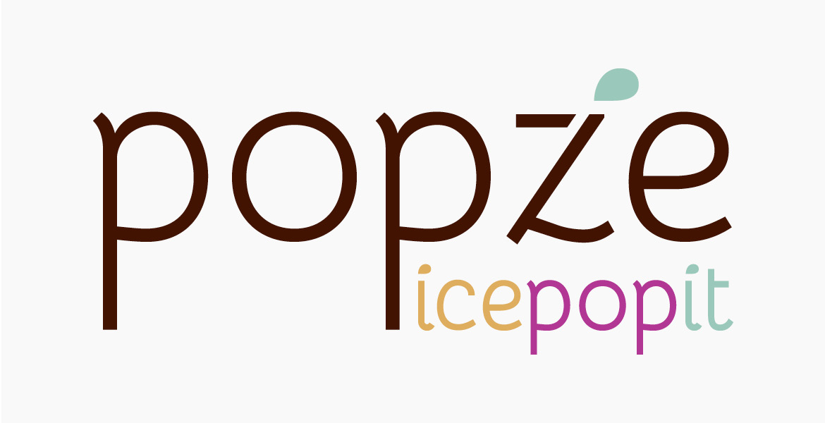
Popze logo
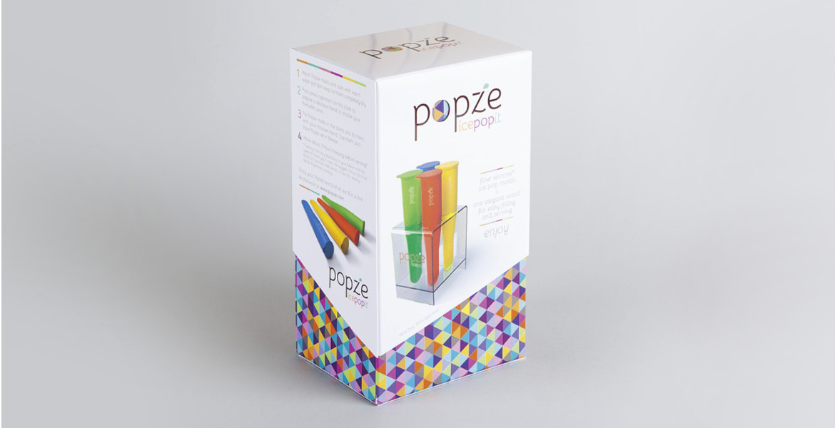

Popze pack - chiuso

Popze pack - aperto
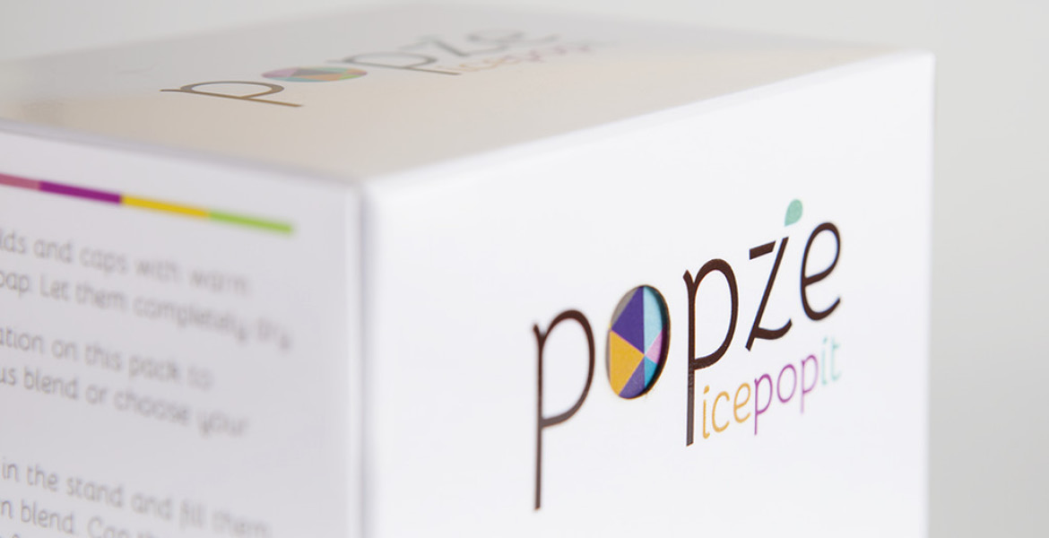
Popze pack - diecut

Popze - stand
Popze è un set di stampi per gelati/ghiaccioli, di quelli che noi chiamiamo impropriamente “Calippo”. È un prodotto molto comune nei paesi anglosassoni ed è quindi difficile fare qualcosa che si stacchi nettamente dalla media.
Dato che in USA questi gelati sono comunemente chiamati Ice Pops o Popsies, ho creato il nome Popze e il payoff Ice pop it. Il prodotto si rivolge a un pubblico di adulti di buona capacità di spesa e con gusto per il design: i bambini erano quindi esclusi.
Il pack si compone di due parti: una scatola stampata a pattern triangolare, che nasce dalla forma dello stampo stesso, e una manica a taglio asimmetrico e fustella in corrispondenza della O del logo. All’interno il logo è riportato sugli stampi e sui reggistampi stesso.
—
Popze is a molds+stand ice pops set. It’s a very popular product in countries like the US or the UK, so it’s challenging to make something to stand out of the crowd. Given their common name Ice Pops or Popsies I created the naming Popze and the endline Ice pop it. The product is aimed to affluent grown-ups and children are excluded.
This is a double pack: a box printed with a triangles pattern (that comes from the mold shape) and an asymmetrical sleeve with a diecut instead of the O logo. The logo itself is on the molds and the stand too.
- Date: 2014/2015
- Categories: Graphic design / Logo design / Packaging design / Progetto grafico
- Client: Fighter Pilot In The Kitchen