“Endless fun”
It’s always interesting to work on a product you’re not familiar with, especially when it’s not even widespread in your country.
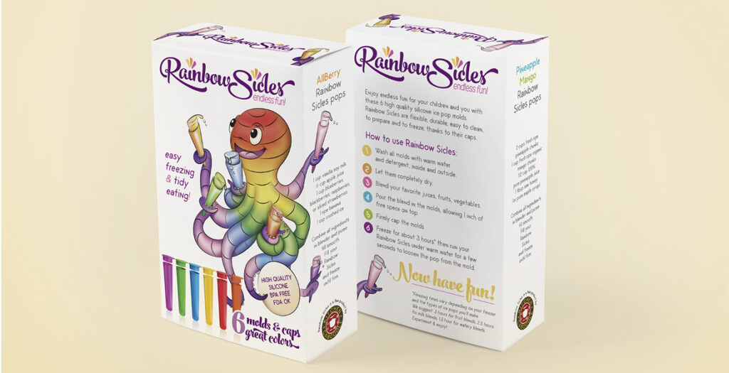
Rainbow Sicles is a line of silicone molds for ice creams and popsicles, targeting children and their families. The name had already been decided, so I worked on designing the logo, writing the tagline and product texts, and creating the mascot—which was first drawn traditionally and then inked and colored digitally.
The little octopus was chosen after researching graphic trends in the industry. I wanted a “weird” and unusual animal, something that wasn’t too masculine or feminine. The tentacles gave me the idea of endless possibilities—perfectly matching the brand’s playful and creative spirit.
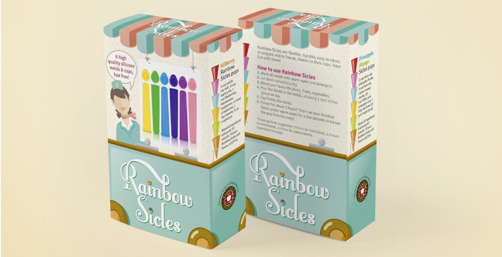
The logo and alternative packaging were designed with families in mind, making them slightly less playful while still maintaining a fun and engaging look.